Branding
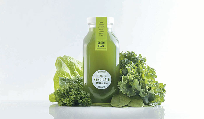
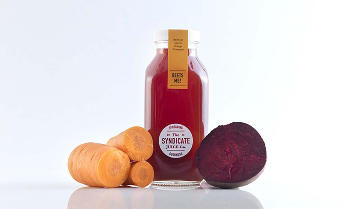
The Syndicate Juice Co., Singapore (2014)
—
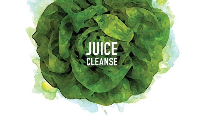
3 good friends conceived the idea of healthy living whereby they would spread goodness in the form of freshly cold-pressed juices (just like a syndicate that promotes common interest ― of course in this case, it’s the good sort of syndicate).
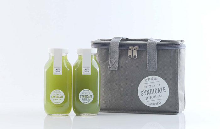
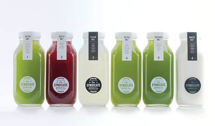
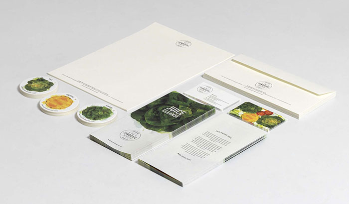
The logo takes the form of a stamp which associates itself with the mark of quality and guaranteed freshness. A clean, natural look was themed around the brand, as it was designed as down-to-earth as possible. Collaterals sport neutral tones and glass bottles - instead of plastic - are used to bottle the juices, adding in the environmentally friendly touch. Cold-pressed daily, the Syndicate seeks to imbue you with fresh, healthy juices.
—