Branding
Digital
Integrated
Interior
4 Fingers, Singapore (2009)
—
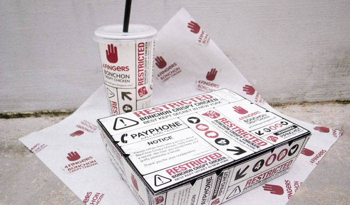
Social cultism was the main inspiration for creating an atypical brand identity and interior for this fast food joint. The logo, made up of four fingers, is representative of an underground hand signal for non-mainstream, cool social acceptance.
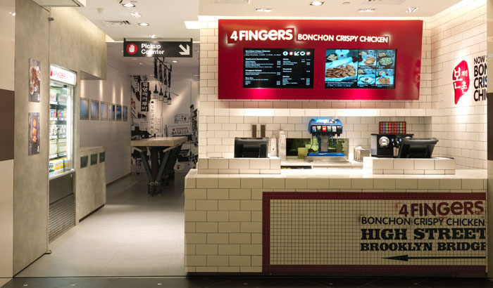
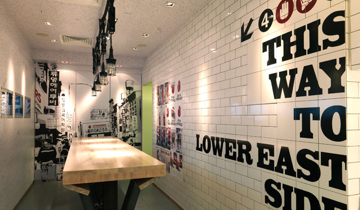
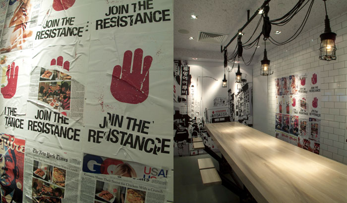
To emulate this underground movement, we set 4 Fingers Chicken against a New York underground subway scene, replete with ripped posters, graffiti and a pick-up counter styled like a station directional sign.
On the walls are subway tiles indicating where Korean-style Chicken has made its mark at the Lower East Side and Brooklyn. The use of white tiles lighten the overall visual weight, while oxidised steelworks in the form of a replica train cart door and shipyard-style hanging lamps help accentuate the space’s industrial rawness.
—
www.gimme4fingers.com

