—
Branding
Digital
Branding
Digital
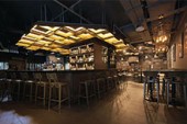
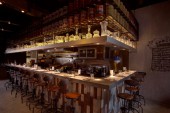
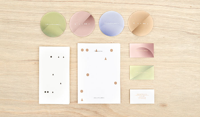
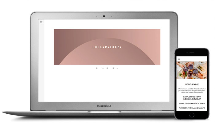
Lollapalooza, Singapore (2015)
—
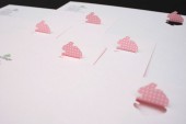
Lollapalooza, the big sister of Lolla, serves dishes with a sophisticated finish. Inspired by the multiple ‘o’s and ‘a’s the brand name contains, circles and triangles respectively, form the core of the graphics. Its appearance can be seen in both obvious and subtle applications. A combination of gradient colour tones and copper materials bring out the light-heartedness in the brand. Menus are updated daily to ensure customers only get the best of their freshest produce.
—
http://www.lollapalooza.sg